
Why information architecture is the most critical component of any user experience
Given the prevalence of the internet in our lives, it would be difficult for anyone to dispute the importance of maintaining a digital presence for your company. Generally, businesses know that it is important to optimize for searchability, but it’s less common that they give the time and attention to make their content easier to consume for the end-user.
While searchability ensures that your web properties are easy to find on the internet, it is information architecture that defines how your end-users will interact with your website. We live in a world where people expect to find a solution to their problems with the least amount of effort. If finding a solution is too complicated or too slow of a process, users will abandon their search even when they know the answer is out there, somewhere.

Figure 1.1 - Length of the human attention span (1)
Information architecture shows your visitors how and where to find relevant content, helping them to quickly navigate complex sets of information and data. It’s not limited to just long-form content either; information architecture is a concept deeply embedded in the foundational practices of user experience (“UX”) which extends to both physical mediums like interior design and print media as well as intangible properties like websites, data and digital design assets.
The following infographic defines information architecture:

Figure 1.2 - Definition of information architecture (10)
Still not sure if information architecture is really more important than design? Consider this:
Over 90% of the data currently available on the internet was created in the last two years (2)
With more data available at our fingertips, we’re spending more time online, but the constant state of overwhelm caused by such abundance of information has reduced the human attention span to a mere eight seconds (3). That means you have a very short window of time to get your users to the right place when they arrive at your site.

Figure 1.3 - Daily hours spent with digital media, United States, 2008 to 2018 (4)
Given this information, we propose that graphic design is secondary to information architecture for two reasons:
Good information architecture will inherently improve search performance, and;
Information architecture improves UX, or a user’s ability to interact with your site and increase the probability of conversion against a call to action.
By structuring your data first, you can easily identify content gaps and requirements for design while simultaneously ensuring that all of these assets are easily accessible to the end-user.
Data, then design
So how do you execute effective information architecture? When architecting a site either internally or for our clients, we tend to consider the following:
Gestalt principles
Humans naturally group things together based on the relationship between individual elements. Visually, people tend to group elements that are similar, have continuity (i.e. chronological order), or provide closure (i.e. explain the relationship between elements) (5).
Mental models
People generally visit a site with assumptions about how to interact with the content. Information is easier to discover when it’s in a place that matches the user’s expectations of where it should be (e.g. when a user is looking for contact information, the first thing they’re going to look for is a page, link, or section that says “Contact Us” or “Contact”) (6).
Cognitive load
Cognitive load is the amount of information that a person can process at any given moment. This is an especially important element to consider. When architects consider a user’s cognitive load, it helps them prevent the user from being overloaded with too much information all at once (7).
Recognition patterns
People visiting a website or using a mobile app expect to see certain features associated with a particular product or service. Designers apply recognition patterns like navigation tabs to make the interaction familiar (8).
Visual hierarchy
Visual hierarchy is directly related to content readability. One essential consideration is the scanning pattern of the page - before reading a page, people typically scan it in a predictable pattern to get a sense of interest. (9).
Once you’ve considered how each of these elements might affect your design and wireframe, it’s time to do some user research. Researching what users need and want is one of the most important steps in creating an effective information architecture. There are two particular areas of interest to explore during the research process:
The range of content required to support your hierarchy, and;
Functionality required to support the site structure (how users search or navigate the site).
In pre-production, information architects generally create wireframes to demonstrate the hierarchy of information
Based on information gathered during research and hierarchy creation, an architect can sketch out screens in order to demonstrate what content should exist on a page and how it’ll be arranged. To do this, you will need to create a taxonomy for your website.
Taxonomies help organize and classify information and features based on similarities and differences. This may appear as categories within a news site, sections within a corporate site or metadata tags within an e-commerce site. Site architects choose taxonomies for a website or app based on the mental model of their target audience (14).
With your taxonomy in place, it is then time to consider how to organize the information visually on the site. You have three options to consider (15):
Hierarchical: this structure helps users to understand the level of importance for each element on the page (e.g. header navigation on a website).
Sequential: this structure creates a guided path for the users, taking them step-by-step through the content to accomplish a task, like a how-to guide or a checkout experience (e.g. a Typeform with custom logic).
Matrix: this structure allows the user to select their own navigation preferences. For example, they can navigate content ordered by date, by topic or by activity (e.g. a responsive, queryable set of content on a website).
It’s important to remember that every end user will interpret your data within the context of their own unique mental models, which is why it is critical that you minimize subjective variations in interpretation through the use of effective information architecture.
For example, we recently launched a responsive word cloud on soEasie.com that visually shows project types demanded by clients over a three-year period. Clicking on a given label leads to a filtered collection of micro-case studies for that specific project type (e.g. engineering).
This interface allows prospective clients to intuitively filter and explore over 300 micro-case studies in a matrix architecture using clickable labels representing each project type.

Figure 1.4 - Responsive word cloud of Easie case studies using information architecture
This is why the understanding of user stories during the pre-product research stage is paramount to the architecting of information: without understanding your user, you can’t understand how they will perceive and interpret your content or even whether or not they will ultimately find the information helpful.
Consider this: we ask two people why there is an empty space in a grocery store shelf.
One of them might interpret this spot to mean that a product is sold out, whereas another may interpret it as being popular. The content is the grocery shelf and items on it, the observations that individuals make are the data, and what each person believes to be true (i.e. scarcity vs. popularity) is the interpretation of the information or the user’s mental model (11).
To achieve this understanding, you might consider performing a content inventory and audit as a part of user research. A content inventory typically appears as a table, listing out each page on a website or in an app, while a content audit gives an information architect information about how useful, accurate and effective the content is (12).
By incorporating qualitative data gathered from user research interviews, you can determine how effective your existing content is and what content might be missing to help them make a decision or answer a question.
Not only should information be properly organized, it should also be properly labeled with unique attributes to best suit the needs of the end-user. Labels can play a significant role for users in determining if they are able to find information.
The structure of the new site header and footer at soEasie.com is another example of deliberate information architecture based on exhaustive background research:
Figure 1.5.1 - Easie site navigation December 2020 (navigation bar)
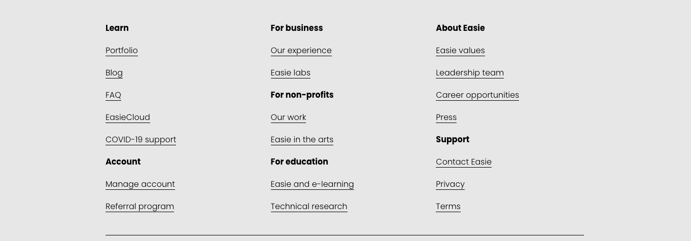
Figure 1.5.2 - Easie site navigation December 2020 (footer)
The last component to consider is how individual components of information should be organized on the site. The most popular content schemas include:
Alphabetical: content is organized in alphabetical order. This scheme works best when users know exactly what they’re looking for and know how to describe or name the object of search, so it can serve as a navigation tool for the users.
Audience: the type of content organization for separate groups of users. For example, educational sites often group information according to the skill level of the learners.
Chronological: this type organizes content by date and time. It’s often used on news websites, event apps and blogs.
Topic: content is organized according to the specific subject. For instance, online book stores divide their products according to genres.
With your wireframe complete, you’re finally ready to start focusing on design, site performance and optimization. Unfortunately, due to the time and planning required for effective information architecture, many companies consider the exercise impractical and skip straight to design.
Neglecting information architecture significantly increases project risk for structural faults in usability and navigation. By investing in information architecture early, you can ensure your new system will be built efficiently and reduce long-term maintenance cost. After all, any developer will tell you that it’s significantly easier (and subsequently cheaper to your business) to make design modifications after the initial release of the system than to make dramatic structural changes.
Easie can help develop your unique information architecture
Schedule a free 15-minute consultation.
Citations
https://medium.com/@ashishaa/the-shortening-human-attention-span-c7eb80cb6839
https://dl.motamem.org/microsoft-attention-spans-research-report.pdf
https://www.interaction-design.org/literature/topics/gestalt-principles
https://www.interaction-design.org/literature/topics/mental-models
https://uxdesign.cc/the-fundamentals-behind-visual-hierarchy-4323c85fb186
https://uxdesign.cc/a-brief-history-of-information-architecture-d26b17205e7b
https://uxdesign.cc/hierarchical-taxonomy-ux-designs-secret-weapon-9510eb91a4d
https://webstyleguide.com/wsg3/3-information-architecture/3-site-structure.html
This article was edited by Rock W. Vitale.
Relevant case studies
Frontend-development
UI/UX
Design